

Blog
Designing an image popup that brings in more conversions
When it comes to making an image popup, the easiest way to do it may be simply by downloading an image from the Internet and using that image to make the popup according to the instructions. But is the easiest route the one we would like to take? Of course, not because considering copyright issues, it would be much better if you could design your own image to be used for making an image popup. What’s more, designing your own image is even a necessity because it’s highly preferable to include a unique and attractive text message in your popup and make a choice of more attractive and psychologically appealing colors. Accordingly, in the scope of this article, we are going to tackle two important issues such as:
-
How to create an engaging text for your image and
-
How to pick up colors that are more pleasant to the eye and therefore, tend to attract more attention.
So, let’s discuss these two points separately
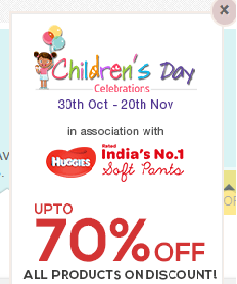
- A correctly compiled text message comes to fulfill the objective of the image and is more informative. For example, if you are the owner of an e-commerce website, you can announce a discount by using an image popup on your landing page. You will need to mention the amount of a discount you are willing to give and the period the offer will last. If you wish, you can include your brand logo along with the informative text on your popup. Let’s have a look at a sample image popup:
Psychology of Colors
- Paying attention to the text, of course, we shouldn’t underestimate the psychology of colors and their potential to attract attention and engage visitors. Though color preference is largely dependent on an individual approach, you should know the basic color preferences, as well as those of certain groups of people. This means that targeting is important here as well. If your business is around women’s goods and accessories, take care to choose colors that are appealing to most women. The colors ladies prefer are mainly blue, green and purple. Blue is also the favorite color for most men. Actually, this is the color most people love. The male population is also fond of black and green. Women generally dislike brown, gray and orange. In their turn, men dislike brown, orange and purple colors.
Targeting according to item colors
- But targeting is done not only according to the preferences of different gender representatives but is also conditioned by the specific types of the items to be sold. Thus, it is well-known that orange is a color for cheap items. On the contrary, black is a color for prestigious, elegant and expensive items. Items in purple look glamorous. There is an interesting statement about the blue color. According to this statement, food delivery services try to avoid using this color. The reason lies in the fact that blue is associated with poison. Therefore, the business owners operating in the food industry should not use blue dishes and accessories. Also, it is not recommended to use the blue color on your site if you are in this industry.
Brand Logo Colors
The recommendations stated above also suggest that you can study brand logos to design an appealing image for your image popup. As a rule, brand owners use two or three colors, sometimes also their hints for their company logo. Here as well, red, blue, green, yellow and orange are among the commonly used colors. And don’t forget about the white as this is a color of purity and matches beautifully with any color.
To Wrap It Up
If you would like to create an image popup to make better conversions, you should certainly start with designing a beautiful and informative image where both the text and the colors chosen matter significantly. As to the text, it should be eye-catching and cover the information you would like to convey. Also, the influence of colors on human psychology and the core role it plays in targeting shouldn’t be underestimated. You can target the audience that is supposed to purchase your products and the type of items you are selling on your site. This way you can determine the colors that should prevail on your website. Also, don’t forget to take general color preferences and traditions into consideration.