Blog
Make Your Popups Polite and Unaggressive
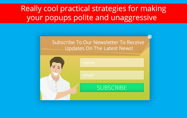
Recently, we have spoken a lot about the importance of being polite and mild when it comes to the usage of popups. Imagine you are a company representative who has been assigned to visit several companies and to make certain offers. Would it be acceptable for you to make the same offer over and over again after getting a refusal once? Well, at least, your second offer has to be more beneficial in order to capture the addressee’s attention. The same works on the web. Making the same popup appear more than once creates an impression as if you want to force something to your audience. And as we know, none of us wants to be forced to do a thing. Likewise, there are a lot of other features that make your popups aggressive. So, let’s get to know them so that we can bypass setting up configurations that make our popups aggressive and accordingly, less functional.
Make your popup easily manageable
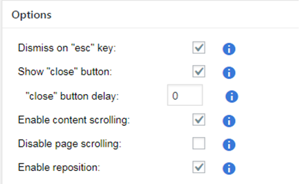
The fields checked in the screenshot below are some of the configurations responsible for making a polite and unaggressive popup. These options are checked to make a popup easily manageable. So page visitors can dismiss the ad anytime by pressing the “Esc” button on the left corner of the keyboard or by clicking on the “close” button. In addition, you can also enable moving the popup window to see what’s beneath. For this purpose, you need to check the “enable reposition” option. Also, in case you wish to convey lengthy information through a popup window, just check the “enable content scrolling” option. This will make it possible for your visitors to scroll down the text in the popup and get familiarized with it.
Dismiss popup on overlay or on content click
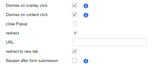
Also, you can check the “dismiss on overlay click” and the “dismiss on content click” sections to make your popup window disappear when clicking on the overlay or on the content respectively. This is especially functional in case you have decided not to provide a “close” button on your popup. Not having a “close” button is more characteristic to aggressive mode popups. If you have decided on the aggressive mode for some reason, you can make your popup ad a bit softer through the usage of these features. This way, checking these fields will enable your visitors to dismiss your popup after viewing its content. You can do it either by clicking on the overlay or on the content itself.
Make your popup polite enough so as not to obscure your website content
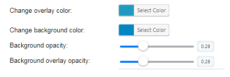
In case you place background opacity at its maximum, the content of the page behind the popup will not be visible. This is a feature characteristic of the aggressive mode. Would you like to visit a webpage and to see a popup without having the opportunity to view the page content first? Answering this question will help you decide how your popup should affect the look of your webpage. Nonetheless, you may wish to make the background a bit opaque based on your design considerations. Increasing the background opacity only to some extent and perhaps adding some color to the background will give a special effect to your popup. Here, we have set conventional colors and opacity settings in order to show you how this works. For sure, you can set the color and configure opacity settings in accordance with your taste and your website’s design preferences. Just make sure not to conceal your page content completely.
Make them moderate!
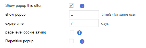
Have you ever thought why people don’t usually like popup ads? Certainly, that’s not because they are so bad. It’s because of the incorrect settings website owners give to them. Thus, when it comes to popup usage, being moderate plays a key role. We master a golden rule: “People don’t like being forced to do something”. So, don’t oblige visitors to consider your offer! Just make a mutually beneficial offer through an eye-catching popup ad and let them decide if it is of interest to them. Well, but what do we mean by calling a popup mild or moderate? Let’s see how to display a popup ad to the same user only once. Accordingly, when a website visitor closes the popup ad, it is not supposed to appear on his/her screen again during the same session. Thus, you show your respect to your visitors’ preference to close the popup window.
Make your popup comfortable to view on any gadget
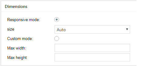
Nowadays users view websites not only on their computer screen but on other gadgets as well. Because manufacturers will never stop creating new devices, programmers have developed the responsive web design method as a solution to the problem. Thus, through this method, website content can be adapted to any device. In this case users don’t have to go to different directions on their gadgets to view website information. Most website owners have already started making their sites responsive. What about popups? Actually, most site owners use popups that cover the whole screen on smartphones. This attitude is far from being polite. However, you can avoid this if you check the “responsive mode”. Then check the size “auto” in the “dimensions” section. As a result, the popup resizes automatically depending on the type of the device used to view your site.
Scheduling popups
Do you receive popups on your smartphones with Chinese hieroglyphs? You can’t decipher Chinese hieroglyphs, can you? So, we are sure that most of our readers can’t do that either. Then why do these ads keep coming? To solve this problem we have created an opportunity to allow or disallow showing the popup in certain countries.

In Conclusion
The reason people dislike pop-up ads consists in the fact that many of them appear to be aggressive. These aggressive and impolite popups tend to spoil the reputation of those that are really powerful in attracting attention and serve as a strong call-to-action.


