

Blog
5 Common Popup Mistakes You Should Avoid
It has been tested for a long time that popup windows are effective hints about any kind of info related to our site. These little helpers enable us to be in touch with people online. But we all know that the main purpose of popup usage is to ask a visitor to become your subscriber. But here we should keep in mind that only in case of good popups your visitor will trust you and fill in his/her details. In order to have pleasant popups, there are some frequent mistakes you should avoid. “Good popups” do not bore page guests and are used for the right purpose.
With this post we are going to speak about the main mistakes that many of us often make. I would like to help you avoid such mistakes in order to make your user experience better.
The Secret of a “Good” Popup
An advanced popup is perfectly timed, has an appropriate design fitting your site and the tastes of your audience. Before showing you the mistakes, let me notice some essential points that each of us should know when making a good popup.
Let’s dive in: “Good” popup
- Corresponds to site content
- Comes out after some time of a user’s visit
- Supplies promising offers (you can test it to see what your visitors are interested in most of all)
- Helps to make the visitor to stay longer
- Does not show up often
In fact, a huge part of marketers use the mentioned tools for showing good ones to their page guests. The most far-reaching is that they use them not just as a marketing tool, but also as a basic part of their webpage. Popups definitely play a particular role in increasing conversions.
Common Popup Mistakes to Avoid
With that in mind, now come to find out the mistakes that costs you conversions.

Mistake 1: Not controlling Popup showing Time
When creating popups, it is one of the essential conditions to choose proper time for its visit. Be sure that all marketers will approve this. If the popup visits too soon, the probability is high that you will lose a visitor. The same will happen when you make your popup show up too late. In this case, you will lose the chance to make your guests see your inviting popups.
What to do
There is no exact time for showing a popup. You just should try to comprehend what your guests are interested in and catch the time that they spend on your website. In other words, you need to understand how much time is required for your guest to get acquainted with website content. Actually, it is proven that the right time for popup visit is 60 seconds after the visit. In fact, 60 second are enough to understand your site completely. Then, your offers will be more likely to interest your guests.
Mistake 2: An Incorrect Frequency for Your Popup Visit
Have you come to the idea that the more you make your popups appear, the more benefits you will bring to your site? Actually, this is not so. If you show a popup to a visitor every 5 minutes, your guest will undoubtedly become nervous and close your page. Or if you overuse your popups showing them on all pages of your site, you will lose a great amount of promising subscribers. So how to find a right frequency?
What to do?
You should respect your users’ choice to accept your offer or not. The best solution is showing one popup on every new visit. If the guest returns, show your popup only after a week. So it will be better if you minimize your popup showing for the same user.
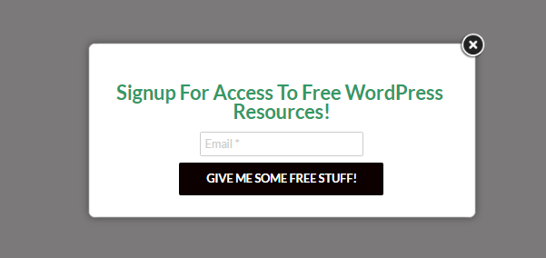
Mistake 3: Requesting too much information
Bear in mind that users are reluctant to give too much information on websites. So if you ask less information, you will have more chances that they will accept your offer. We all realize that based on our business, we have to possess some information about our users. But everything should be within limits.
What to do
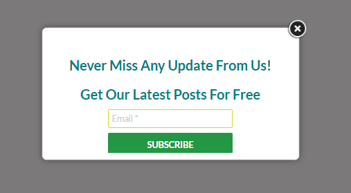
It will be better that you ask your guests for their email only. Avoid asking their name, surname, phone number and other annoying questions. This only applies to one step popups.
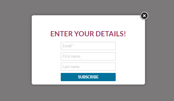
As for multi-step popups, you are free to ask for other information. When you have an offer for your page guests, they only need to choose Yes or No. After clicking on Yes, they will need to fill the additional boxes with their contact details.
Let me illustrate my idea through a popup that I have made through Popup Builder plugin.
Now let’s have a look at another example of a multi-step popup. Here I have asked my guests whether they want to subscribe or not.
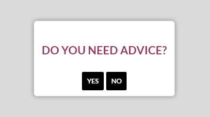
As they want to become my subscriber, they will click on Yes. Then, they will pass on to the second page to fill in the rest of the required information.
Mistake 4: Huge Popups with no Visible “Close” Button
The popups you make should have a visible “Close” button so as visitors can close it if not interested. So, when there is no “Close” button, nothing else is left to do but to leave the page.
What to do
In order to stay away from such non-polite popups, your first step should be to find an appropriate plugin, which will give you a chance to customize your popup and give any design to it. One of such plugins is Popup Builder. It has all the options to be the best solution for polite popup creation.
If you want your popup not to annoy your guests, they should cover 20-30% of your page. Anyway, if your user is really interested in your content, he/she will not ignore your popup. So there is no need to overdo them. It will have the adverse effect. The next important detail is the “Close” button that should be visible.
Mistake 5: Presenting bad offers
Regardless of the beautiful design of your popup, it will not be productive if your offer is not attractive. The offer should be to the point so as to arouse interest in your guests. Your offers must be relevant, and they should sound as promises. So, if you offer something, bear in mind that you should do what you say. Just imagine that you are looking for dresses online, and after some time there appears an attractive popup with an offer like “50% off on evening dresses”. But when you want to see the offers, they are not so many. So, do not disappoint your guests, they are your potential email list members.
What to do
In order to achieve your goal, try to have original offers that are not available elsewhere. Apart from this, never repeat the same offer on the same page. If it did not give a result once, the second time will not change anything.
Now come to see some effective offers:
- Exclusive Deals – If you want your guests sign up for your newsletter, show them the benefits that they will have. Offer them exclusive content, your website updates and many other unique proposals.
- Freebies – For example, you can suggest free shipping of a product.
- Discount coupons – It is a good idea to offer your visitor attractive discounts for the product they are interested in.
Alternatively, through popup windows you can just ask your visitors if they like your page or not. Or you can give them a piece of interesting information. The choice is yours.
Have you seen any other popop mistakes? You are free to comment them. We’ll discuss it together.